The Logo That Became My New Baby
How I went looking for a very simple logo, found a mark I loved, and ended up reimagining an entire NIX DRONES world — from the website to the kit I carry and the places I go.

It started with three words: very simple logo.
I wanted to strip NIX DRONES back to something that looked instantly right. Not another complicated drone drawing, not a badge full of tiny details, and certainly nothing that would disappear when it was printed on a cap. A proper symbol — confident, recognisable and mine.
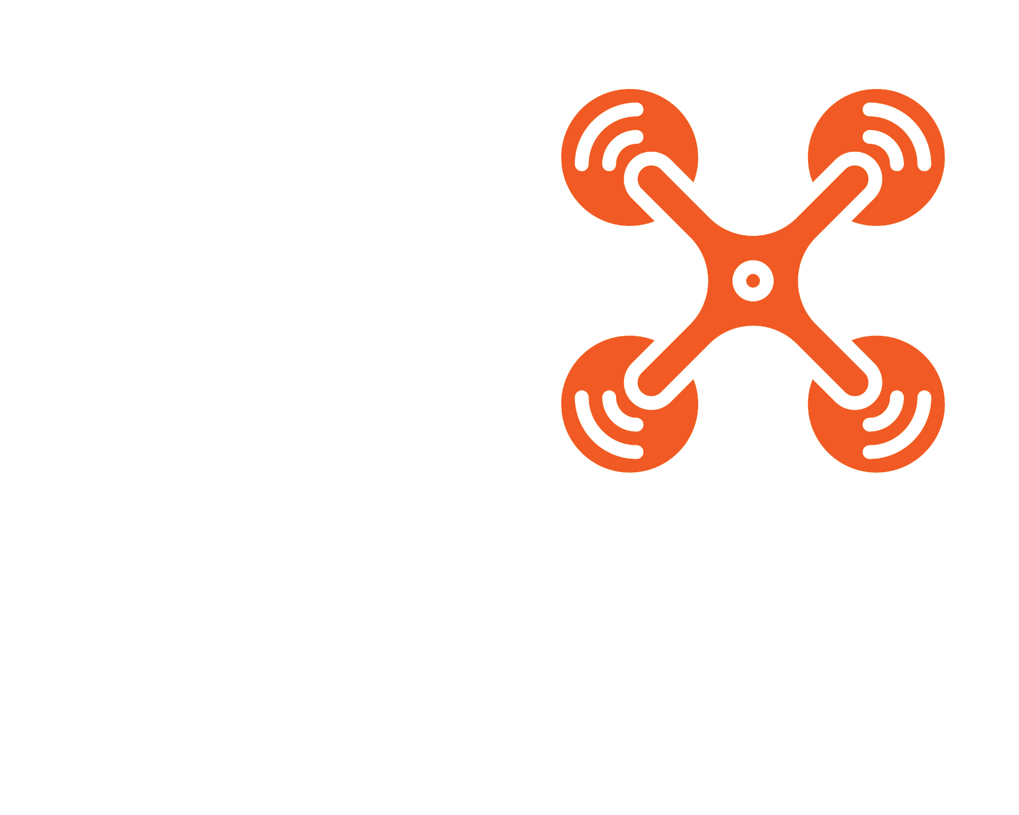
We explored six simple directions. I kept coming back to the bottom-left concept: four sweeping corners around a sharp, dynamic centre. I could see the movement of a quadcopter in it, but I could also see a mark that would work on a website, a jacket or the side of Vanilla.
What the mark means to me
Those four curved shapes suggest rotor movement and the freedom of flight. The central strokes give it speed, direction and a little attitude. The geometry feels balanced, like a drone hovering steadily before heading off on another adventure. That is my interpretation of it — a visual identity born from experimenting with designs, not a mythical corporate brief dreamed up after the event.
The colours were never up for debate. NIX orange — #FF6A00 — brings the energy. White and silver bring the clarity. Dark graphite makes the whole thing pop. The result is straightforward enough for a tiny sticker but strong enough to scale up.
The detail that finished it
I then wanted the web address to be part of the identity, not something tagged on as an afterthought. Now it has a deliberate two-colour treatment: NIXDRONES in white and .COM in orange, aligned as one line beneath the mark. Same technical, spaced-out letter style. One joined-up brand.
And I was particular about the next step: I did not want the new address sitting beneath photographs of old merchandise. I wanted the branding on the actual objects. The designs had to be redone, not merely relabelled.
Vanilla, but make it NIX
Seeing the idea across a van is the moment it really starts to feel alive. A huge orange-and-white symbol, the silver NIX lettering, the orange DRONES line and the website address integrated with the graphics. That is not simply a logo on a screen anymore: it is something that could travel with me.


Clothing for the way I live
I can picture a NIX T-shirt on a sunny shoot, a hoodie at a festival, a cap when I am out with the drone and a beanie when the weather turns properly British. The same mark looks comfortable in each place, which is the whole point of a good identity. It works without having to reinvent itself every time.


The everyday things
Then there are the items that make the brand feel less like a concept and more like part of daily life. A black mug on the desk while I am editing photographs. A travel cup beside me. A placemat in Vanilla and a beer mat on a pub table. Small things, perhaps, but they are exactly the places where a memorable design earns its keep.


From sunglasses to camera gear
The logo also needs to cope with the tiniest spaces. A pair of sunglasses, a keyring, even the top of a drone: the simplified mark should still be recognisable. And on a camera bag or a proper hard case, I want the whole identity to look as if it belongs there, rather than like a random sticker I happened to find in a drawer.


Why this is becoming my new baby
NIX DRONES started from things I love doing: flying drones, taking photographs, getting out on the road and sharing what I find. But now it has become the place where all those interests meet — stories, travel, photography, gear, design and the odd mad idea I cannot resist trying out.
I keep wanting to improve it. The way the site looks. The way the stories read. The way the photographs appear. Even how a little orange detail sits on a hat or a mug. It is the sort of project that follows you around in your head because you genuinely care where it goes next.
That is why I have started thinking of NIX DRONES as my new baby. I am not claiming it is some enormous company. It is something better, to me: a personal creation that keeps growing with every road trip, photo, idea and late-night tweak.
One mark. A thousand adventures.
That is what I wanted from this design: one clean, repeatable identity that could grow with NIX DRONES without losing its character. Orange for energy. White for clarity. Graphite for the backdrop. A little rotor-inspired mark that feels like movement, possibility and a camera looking at the world from a different angle.
There is plenty more to build. But for now, I have a logo I actually want to put on everything — and I reckon that is a pretty good sign.
— NIX